I’ve been working with an interior designer, Nicole, on the designs for my apartment. You can read more about my decision to work with an interior designer here. Today I’m hyped to start sharing the final designs for each room.
The way it works is after going through some initial mood boards, Nicole then showed me two initial designs for each room. We discussed what I liked, what I didn’t like, and any other thoughts I had. We had a few rounds of revisions and edits before ending up with a final version of each room.
Below are the two initial designs for each room and then the final room reveal at the bottom. I figured you didn’t need to see ALL the rounds of edits, that would make for a very long blog post…
First up: the living room! I figured let’s start with a fun bang. And make sure to read my living room design inspiration post which has a bit more info about “must-haves” for my living room.
Design Board: Round 1
Option 1:
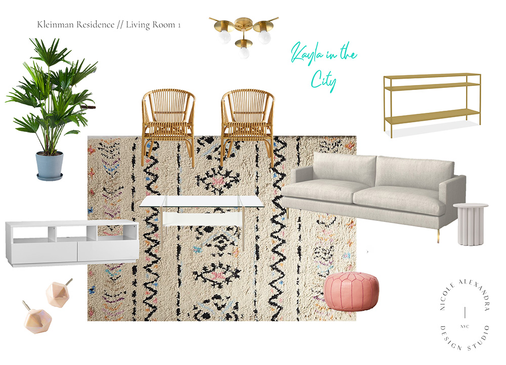
Plant | Chairs | Light | Custom Neon Sign | Behind Couch Table | Side Table | Couch | Poof | Coffee Table | Media Console | Knobs – Sold out | Rug
Some thoughts:
Right away there was SO much that I loved about this design. A lot of these pieces ended up making the final cut:
The rug: When I first saw this rug from Anthropologie I was so-so on it. It totally grew on me, though, and I fell in love with the colors. Spoiler alert, it made the final cut.
The chairs: They are cute and very LA but seemed too uncomfortable to me. I want something cozier and comfier for seating.
The coffee table: I like the idea of a glass coffee table in theory, but this one seemed so heavy if I need to move it around for pictures. I also worry there would be constant finger prints and smudges on the glass.
The Neon Light: I LOVE a neon light. But it didn’t seem super functional for the living room. I knew I wanted artwork or a light there instead. But don’t worry… neon lights will make an appearance in another room 🙂
Option 2:
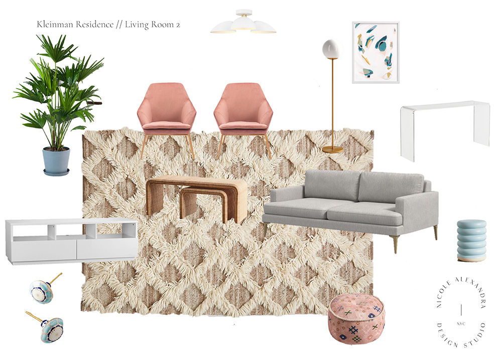
Plant | Chairs | Above Light | Floor Lamp | Behind Couch Table | Artwork | Side Table | Couch | Pouf | Coffee Table | Media Console | Knobs | Rug
Some thoughts:
This version of the room felt a bit too boho for me — although a few pieces did make the final cut:
The chairs: I love these chairs, but they ended up being too similar to my dining room chairs (and I no longer need chairs in the final version, more on that below)
The rug: I like it in theory but I think it actually would feel way to Boho and weird for me. I want something cozy and cushy walk on barefoot.
The side table: I wish I could’ve seen the side table in person but I was worried it would be a bit too quirky IRL. But it’s kind of fun.
Design Board: Final Picks
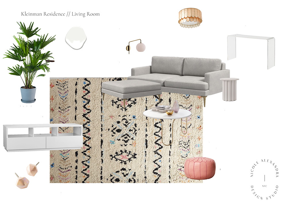
Plant | Above Light | Wall Light | Behind Couch Table | Side Table | Couch | Ottoman | Pouf | Coffee Table | Media Console | Knobs – Sold out | Rug
I am SO excited with how everything turned out:
The couch: I’ve always wanted a couch with a fancy chaise but it wouldn’t work well in the room. I’m even more excited about the matching ottoman solution we landed on, though. It’s perfect. I can use it for lounging on my own while reading or watching TV but it can also be moved to the side when I have friends over as an extra seating area.
Ditching the additional chairs: With having the ottoman I ended up ditching the additional chairs in the room. I know in a few years I can always get rid of the ottoman and add chairs if I realize it’s what I need. But in all honesty, I rarely have a big group of people over, even before the pandemic when I actually had people over. I can also use my dining room chairs or the barstools from the kitchen.
The coffee table: Figuring out the right coffee table was a struggle. Most of them just seemed so heavy and bulky. I am thrilled with this one from West Elm, though, and think it will be just what I need.
Overhead lighting: Changing the overhead light ended up being a last-minute decision. The trio of lights from option one above was present in most of the rounds of edits. Something about them just didn’t feel right — it was almost too raw of a look for me. This light from Anthro really surprised me and I think it will add a nice pop to the room.
Let there be MORE light: I’m really excited about the globe light above the couch. It swivels which means I can use it over the couch when I’m reading or closer to the dining room for extra light. Plus the outlet next to the couch is already attached to a lighting switch. I love that it’s on the wall and won’t take up any floor space behind the couch.
The side table: There is something so cute about this side table to me. I also spotted it on Instagram recently and it looks amazing.
✨
Your Turn: Do you agree with my final picks? Anything you would’ve kept from the first round of designs?

Leave a Reply