After 10+ years of eating all my meals on my couch, I am very, very, excited to have an actual dining room area in my new apartment. It feels very grown-up 😂
I had a lot of fun working with my interior designer, Nicole, to figure out the perfect dining room vibe. Below are the initial two designs for the dining room and then there is a final design reveal at the bottom. Nicole and I went back and forth a few times perfecting the design, but I figured you didn’t need to see ALL the rounds of edits, that would make for a very long blog post…
Also, you can check out my initial dining room design inspiration here.
Design Board: Round 1
Option 1:
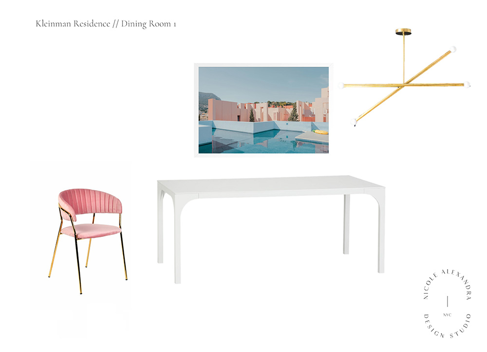
Some thoughts:
Of course, I immediately LOVED the pink color scheme.
The Chair: The color is SO cute. I love pink and gold together. I wasn’t totally sold on this chair, though. Something about it didn’t seem very comfy to me. But the vibe was SPOT on.
The Table: It’s simple, but I really like this table. My media console is the same material, also from CB2, so I liked that they would go together. I wasn’t sure if I wanted a rectangular table or an oval.
Art: Oh, this art piece. It’s definitely a splurge and one of the bigger investments furniture wise for the new apartment, but I loved it right off the bat. It reminds me of a mix of LA meets a tropical vacation.
Light: I made a last-minute decision to not go with this light — but had been pretty sold on it up until that point. I think it’s SO cute. But I wanted something with a bit more “Umph” so to speak. I also wanted more light in the room and worried this wouldn’t be enough.
Option 2:
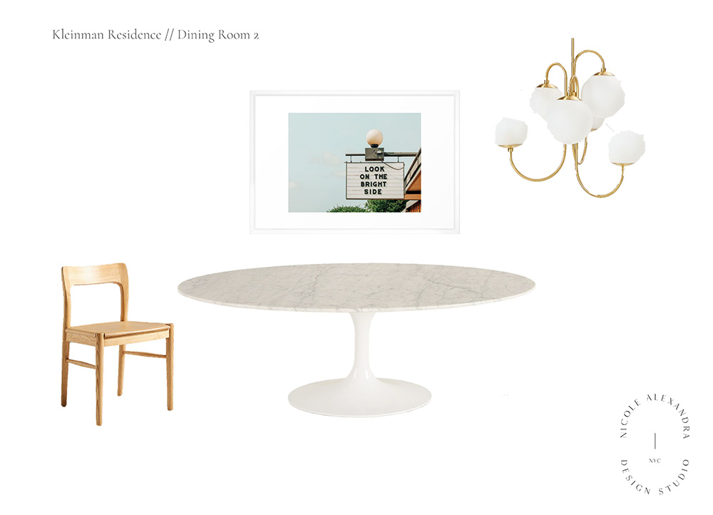
Some Thoughts:
The Chair: It’s a beautiful chair, but not really my style. I also imagine would be a bit uncomfortable. But maybe that’s just me.
The Table: I’ve always wanted a marble table. I was immediately drawn to this option, although like I said earlier I wasn’t sure if I wanted an oval vs. rectangular table.
Art: The art is cute, but I wanted something a bit more vacation-y.
Light: I liked the idea of this light, but didn’t want something that takes up this much height space since the ceiling is a bit low.
Design Board: Final Picks
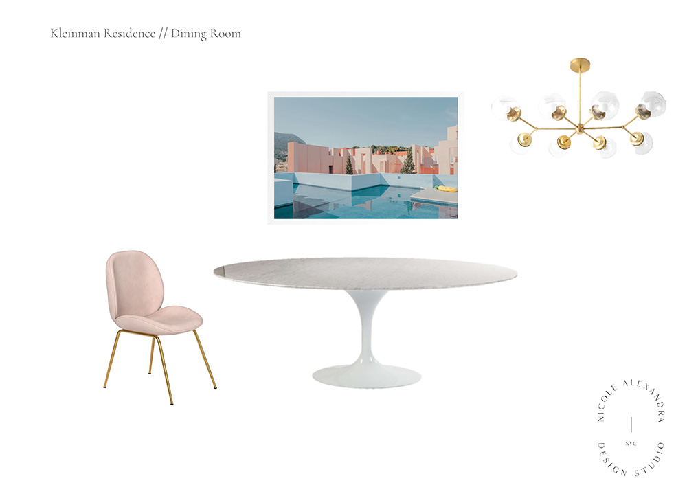
The Chair: Nicole actually suggested this chair after I posted an Instagram story with it. I really, really love it. It looks relatively comfy and has a nice pop of color without being too pink.
The Table: I ended up going with the oval table and I’m SO happy I did! This was actually the first piece of furniture to arrive a few weeks back and I LOVE it. The marble nicely compliments the grey countertops in the attached kitchen.
Art: As I said early, definitely a splurge and I’ve never invested in art before. I actually remember saving this a few years back and I think I posted it to Instagram eons ago because it looks super familiar to me. I’m very excited to see it hung up on the white painted brick wall in that room.
Light: I made a last-minute decision to change to this light. As I said earlier, I wanted to brighten up the room with more literal light. And this chandelier definitely does the trick. I also like that it has a sense of presence but without being too much of an attention stealer. I saw it for the first time IRL yesterday and OMG! It’s perfection — I don’t have a great photo of it just yet but will soon!
✨
Your Turn: Do you agree with my final picks? Which light would you have picked?
✨


i LOVE your picks!!! the style is so beautiful – minimalist, feminine, and modern! can’t wait to see it in person, i’m so excited for you!! <3
can’t wait for you to see in person too! (eventually at this rate 😂)