I moved into my old apartment when I was 20 years old and a junior in college. I made some questionable design choices, to say the least. One of them was a bedroom painted my favorite color: turquoise. While it’s cute in theory, in actuality it’s A LOT of turquoise.
In working with my designer, Nicole, I wanted my new bedroom to feel like both a bit more peaceful that the turquoise life, but still have pops of fun colors. Check out my inspiration here. Below are the initial two designs for the bedroom and then there is a final design reveal at the bottom.
Looking for more design reveals? Check out the dining room and living room reveal!
Design Board: Round 1
Option 1:
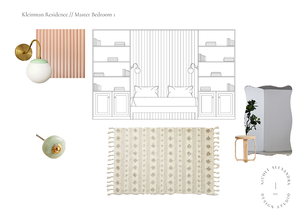
Lights | Knob (similar) | Small Table
Mirror + Rug no longer available
Some thoughts:
Overall this rendition felt a little too “Hollywood in the 50’s” for my personal taste.
The Wall: When Nicole showed me this idea I was intrigued. The wall behind the bed would be a luxurious, padded, velvet with a simple bed. I had never seen anything like it and loved that it felt luxurious!
But it also wouldn’t be cheap to make it happen. I was worried about making a major investment in something like this without being able to fully see the finished product first.
The light: How cute is this light? I’m a sucker for anything cute and mint green. I knew right away this was a keeper.
I realized an ottoman would be more useful to me than another table. And while the mirror is nice, wasn’t my vibe.
Option 2:
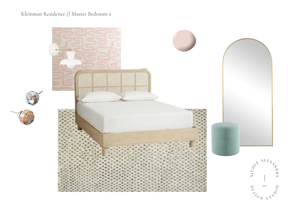
Light | Bed | Mirror | Ottoman | Wallpaper
Some Thoughts:
This room felt a bit more modern meets LA to me, which is definitely what I’m going for.
The Wallpaper: I LOVE this wallpaper (it’s stick-on!) and knew it would be SO good behind the bed.
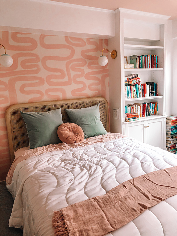
The Bed: I was iffy about this bed at first. I loved it in theory — I’m all about the cane furniture, but I was worried the wood wouldn’t feel cozy. After going back and forth on this for a while, you’ll see this bed ended up being what I went with. Nothing else felt right — and I love that you can still see the wallpaper behind it.
The Mirror: I hate even admitting this, but I wanted a selfie mirror somewhere in the apartment and really liked this one. For the record, I also wanted a mirror to be able to see outfits fully 😂 but I’m excited about the mirror selfies.
The Ottoman: I love this “Kayla-colored” ottoman so so much!
Pink ceiling: I never, ever would’ve thought to paint just the ceiling pink but trusted Nicole’s vision that if she thought it would look good, it probably would.
Design Board: Final Picks
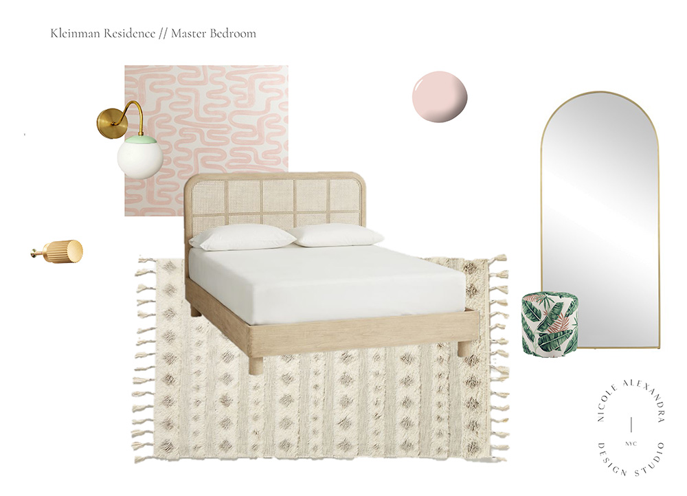
Lights | Knob | Bed | Mirror | Ottoman
I’m really pleased with this final design which combines some of my favorite elements of the first design, but the more modern LA feel of the second design.
While I was sad to say goodbye to the Kayla-colored ottoman, it would’ve been competing with the mint green lights and wasn’t a perfect match. I think the banana palm print adds something really fun and different to the mix.
I’m also in LOVE with the knobs we ended up with. They’re so so so cute.
✨
* This blog post contains affiliate links. Thank you for supporting Kayla in the City!

