It’s time for the final design reveal, the new office/guest room!
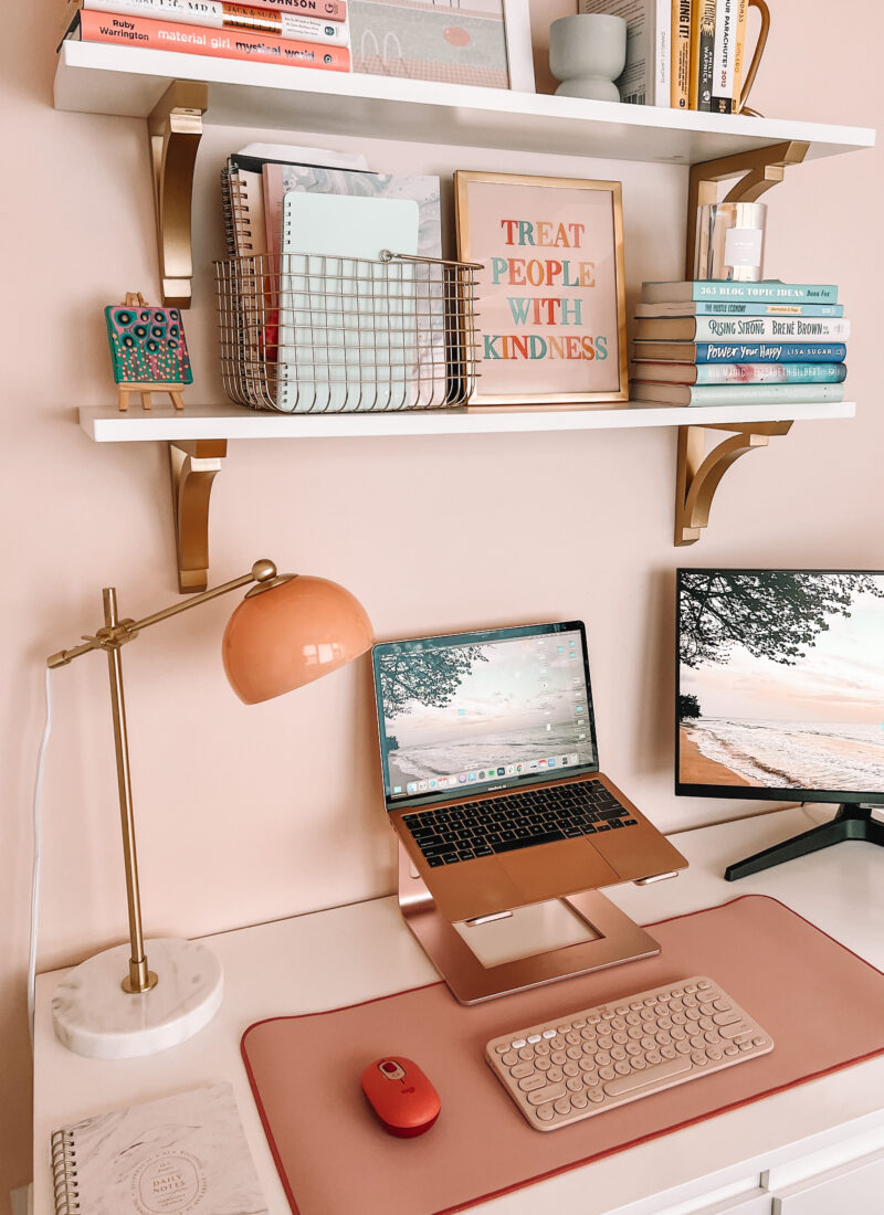
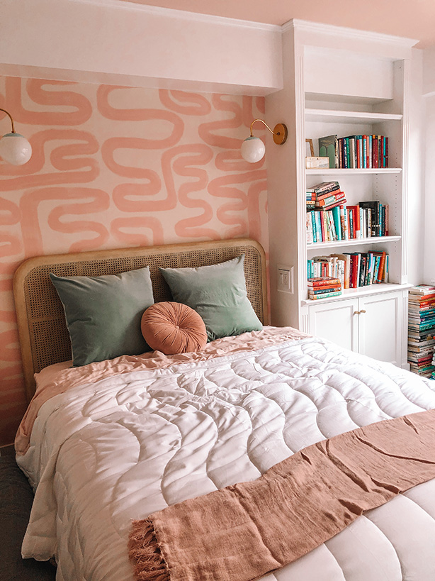
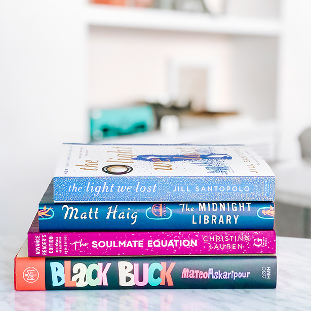
Here was my initial inspiration for the room. I knew figuring out the best configuration and furniture was going to take a bit of creativity from my designer Nicole. It’s one of the reasons I wanted to work with a designer in the first place. I’m SO excited about what we ended up with, and it’s a configuration I NEVER would have thought of. But it works! Below are the initial two designs for the room and then there is a final design reveal at the bottom.
And a little real-time update: If you follow me on Instagram you know that the last of the furniture arrived this week! This room came out more magical IRL than I even imagined. Stay tuned 🙂
Check out the other design reveals for the living room, dining room, and bedroom.
Design Board: Round 1
Option 1:
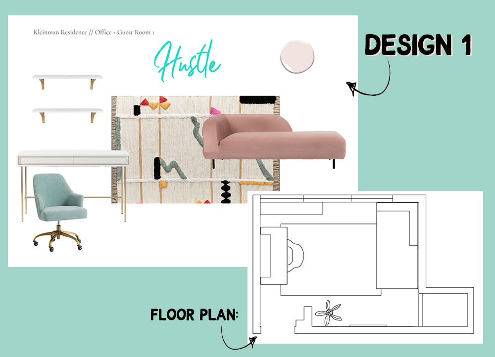
Desk | Shelves | Desk Chair | Rug | Couch | Custom Neon Sign
Some thoughts:
There was a lot about this I loved right away:
The desk, chair, and shelves: Keepers! Definitely my vibe.
The couch/day bed: While I LOVED this couch in theory, it’s so modern and unique, it just didn’t feel like the best option for a guest to sleep. Sure, it’s probably comfy to lounge and read a book. But actually sleeping on it seemed awkward. I’m not sure you could even put a fitted sheet on it.
Neon Sign: I’m a sucker for a neon sign, although I knew Hustle wouldn’t be the word I went with.
Rug: The colors didn’t feel right to me.
Option 2:
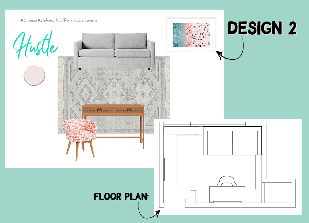
Sleeper Couch | Rug | Chair [different print] | Desk | Neon Sign | Beach Pic
Some thoughts:
Overall this option was not for me. I loved the idea of a sleeper couch but wanted something a bit cuter to look at every day. The floorplan like this was a surprising win. I never would’ve thought to put the couch against the window like it is, but it actually works really well.
Design Board: Final Picks:
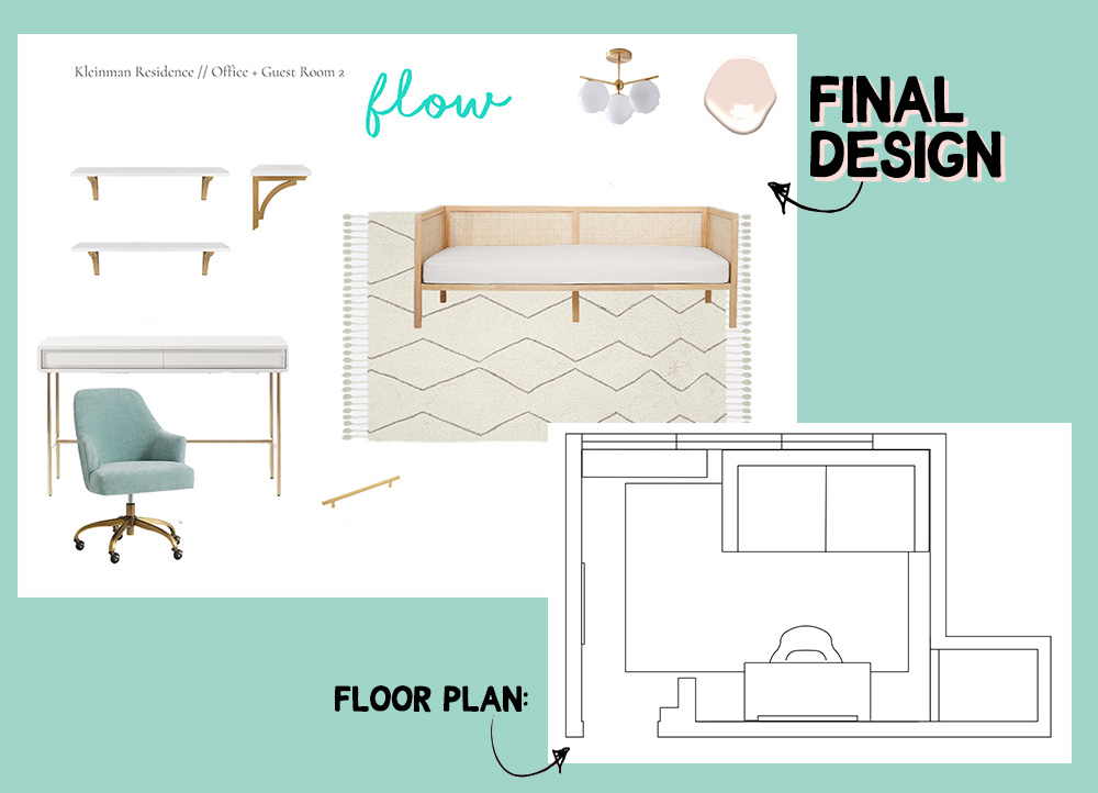
Desk | Shelves | Desk Chair | Day Bed | Rug | Light | Neon Light | Handles
I wasn’t sure how this room was going to come together, but wow do I love the final design. We kept the bed against the window configuration from the second design option, but then started fresh with a different daybed and rug.
Paint: The whole room is pink — ceilings included. After looking at a few different paint samples, Sugar Cane ended up being the winner. It’s definitely PINK but doesn’t feel too saccharine or childish. It’s fabulous.
The Rug: I was a bit torn on this rug and had gone back and forth on it and a few other options. After seeing it IRL in store, though, I was sold. It’s THICK in a really luxurious and cozy kind of way.
The Daybed: I’m OBSESSED with this rattan daybed. It’s functional for when friends stay over, but also a cute place to sit and read — and gives off the LA vibes I want in my apartment.
Choosing a word: I spent a lot of time thinking about what word I should go with for the neon sign. FLOW felt like the right fit for the office space of someone that’s also a yoga teacher. Y’know… Yoga flow. Workflow. Flow state.
✨
* This blog post contains affiliate links. Thank you for supporting Kayla in the City!

